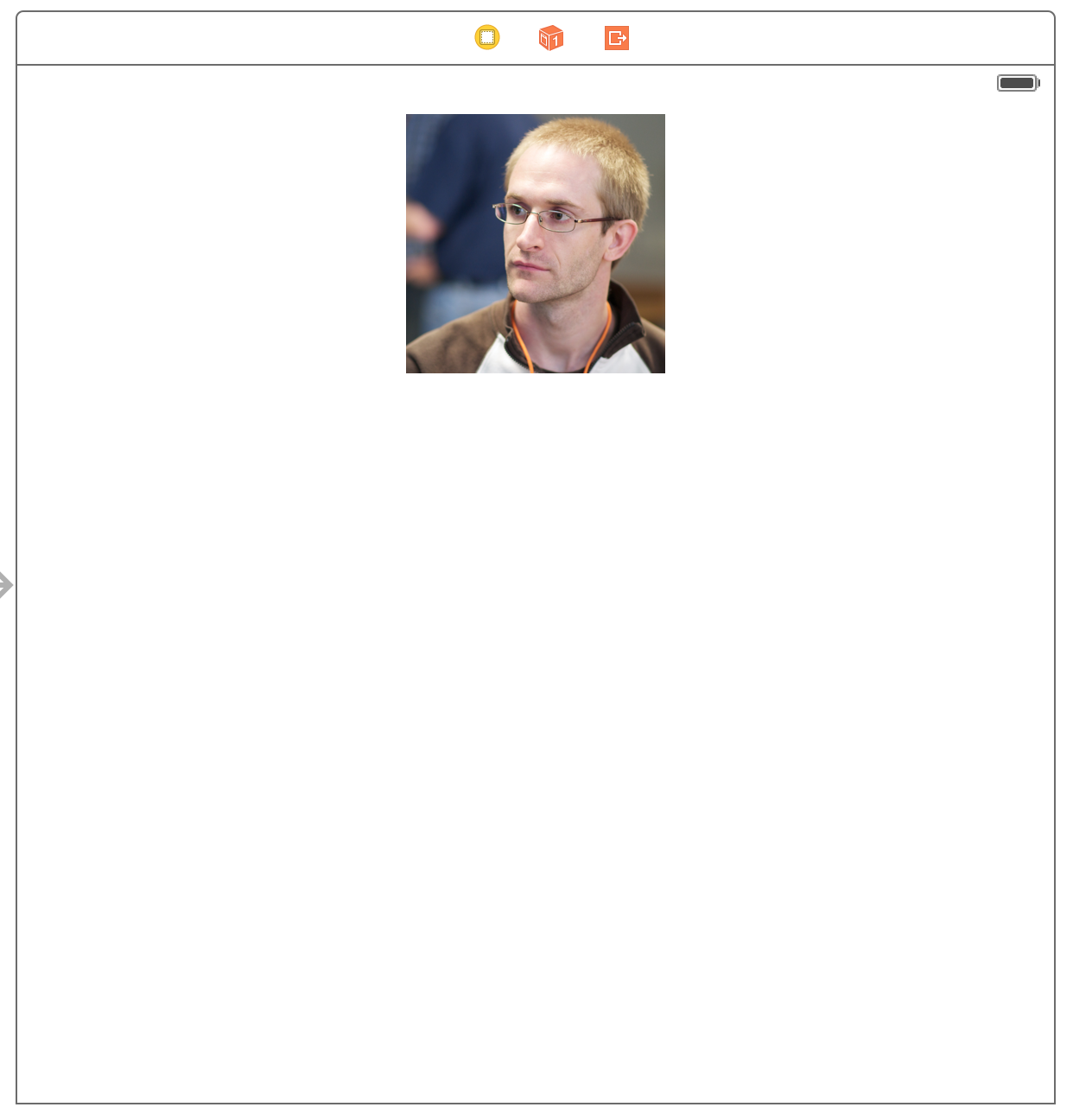
How do you make an image view scale based on device size using Auto Layout in Interface Builder? For example, let’s say we’re building a profile screen that has an image at the top like this:
How can we make the image larger on larger devices where we have more screen real estate – but smaller on smaller devices? Can we do this with Auto Layout in Interface Builder?
I’m happy to tell you that you can, indeed, scale an image view with Auto Layout in Interface Builder. Watch the brief video below to see how.
You can download the sample code on GitHub.
And if you want to learn how to build the rest of the profile screen, you can watch the recording of my Intro to Auto Layout workshop.